What Does “Responsive” Mean?
Let’s make it simple.
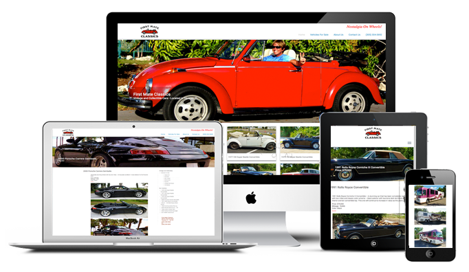
A “responsive” design “responds” to the size of the device it’s displayed on.
Your website has to work on “all devices”…
- Computers and laptops
- iPhones, Android and other
- iPads and Tablets
- HDTV and other
Development + Design
Think of Development as what your site “does” and Design as how your site “looks”. You need a dependable combination of both.
If you’re going to sell products, you want your customer’s buying experience to be user-friendly from start to finish. That’s where a developer goes to work.
Presentation, on the other hand, has to be clean and appealing. Web designers start with flow and layout, then use sharp, clear photographs, graphics and a minimal amount of text to tell the story.
We’re proficient in both development and design.
You See It Every Day
When you pull out your cell phone and look for something on the Internet, you’re seeing Responsive Design in action. Websites that take up the full screen display on your computer at home adjust everything to an entirely different presentation on your phone, allowing you the “thumb” your way down the page.
WordPress =Tools YOU can use
All of our sites are built on the WordPress platform using custom themes and modifications. The advantages of working with a framework so common on the Web can’t be understated. It’s familiar.
Our website designs accommodate the unique needs of our clients, and with the editing and design tools that come with WordPress our clients are able to edit the pages and posts on their sites to keep things current, build mailing lists or interact with customers or fans and much more.